Bankrate
Crafting a meaningful authenticated experience for users who sign up for a lite account.
Overview
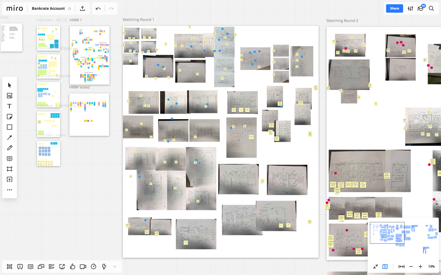
Bankrate had recently redesigned their user account area to be focused on a free credit report and credit factors. While this helped transition users to a newer experience it only scratched the surface for what the team wanted to offer. We held a sprint to determine where we would take the logged in experience next, with the focus on offering a sign up that only required a user’s email address. Our goal was to create an experience that would be engaging and helpful without requiring a soft credit check. With designers and stakeholders across multiple locations we decided to use miro (formerly realtime board) to lead sprint activities in a virtual space.
Discovery
Our initial discovery was focused heavily on interviewing stakeholders from across the many financial products offered on Bankrate. We interviewed key leaders from Deposits, Savings, Mortgages, Personal Loans, Credit Cards and more – gaining insight into who their users were and what kind of features they’d be interested in. We then moved into opportunity mapping by writing How Might We Notes and voting to help align on the focus of the sprint. While there was some energy around remarketing and entry points, we collectively decided to focus on the core app experience post login. From our exercise that was clearly where the most energy and opportunity was. Activities included:
- Stakeholder Interviews
- Technical Constraints Discussion
- Current App Walkthrough
- Past App Walkthrough
- Opportunity Mapping
- Scope & Goal Setting
Ideation
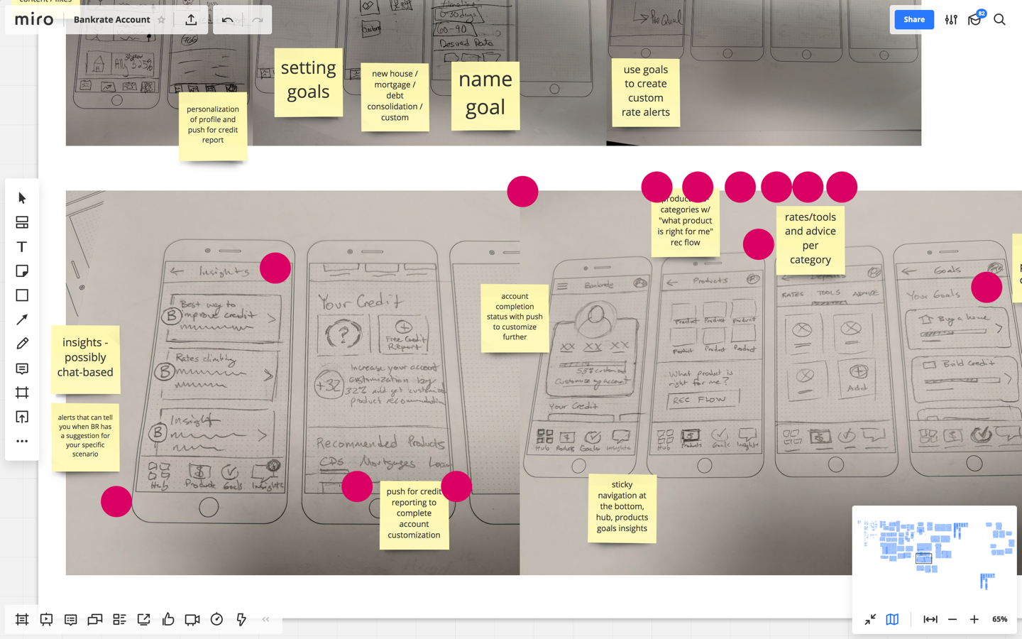
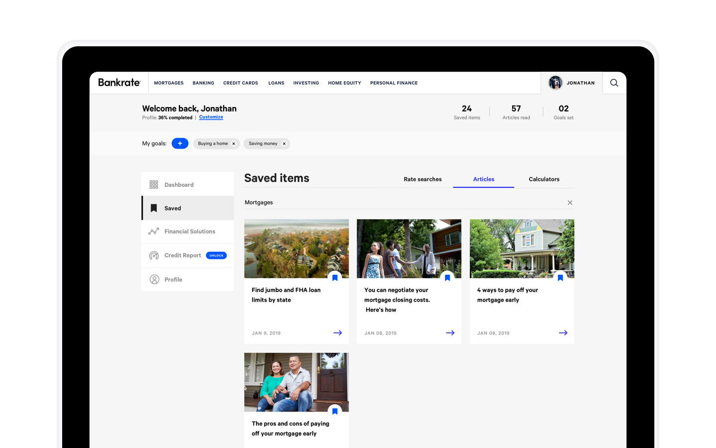
During our initial round of sketching, there were a lot of ideas generated that had interest. One of these was the ability to save content – articles, tools, products, search results, calculator results, etc. Another was the idea of personalizing a user’s experience based on financial goals. A number of team members also were drawn to the idea of a personalized feed that was affected by your preferences. Another key concept was focused on how to educate users at a product level – with tools, content and rates. During our next rounds of sketching and voting, a lot of the effort became how to combine interesting concepts and features into a framework that felt natural to the end user.
Alignment
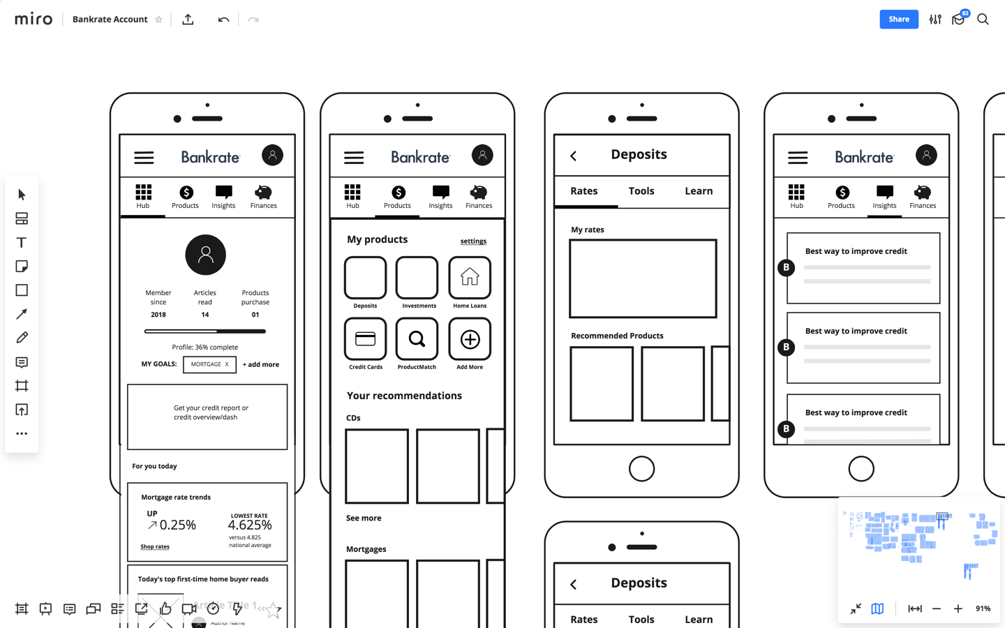
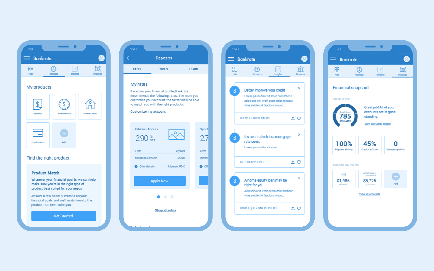
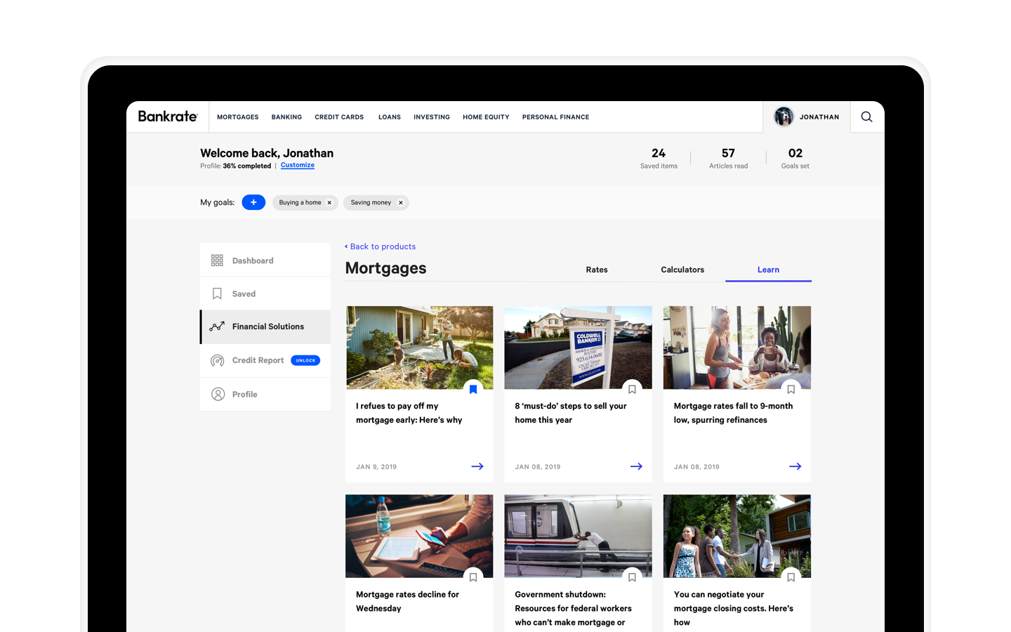
Rather than a traditional storyboard using a whiteboard, we created a rough storyboard within the miro app itself. The solution was an app that had 4 major sections. A hub that housed a personalized feed. A customizable products area where you chose what financial products you were interested. An insights area that surfaced alerts and insights based on your behavior and goals. And last a credit report area that included the existing functionality.
Wireframes
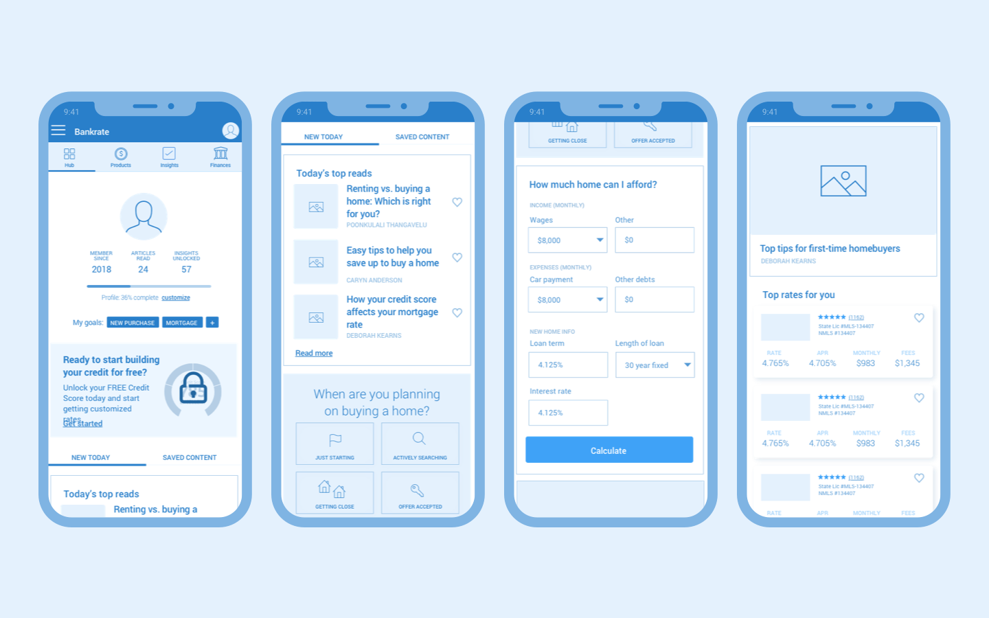
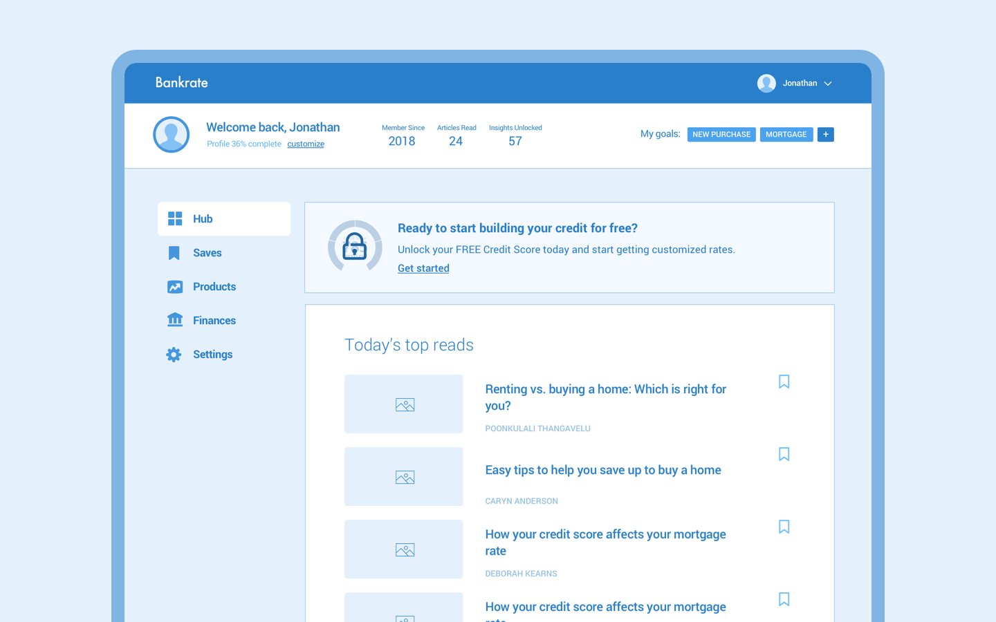
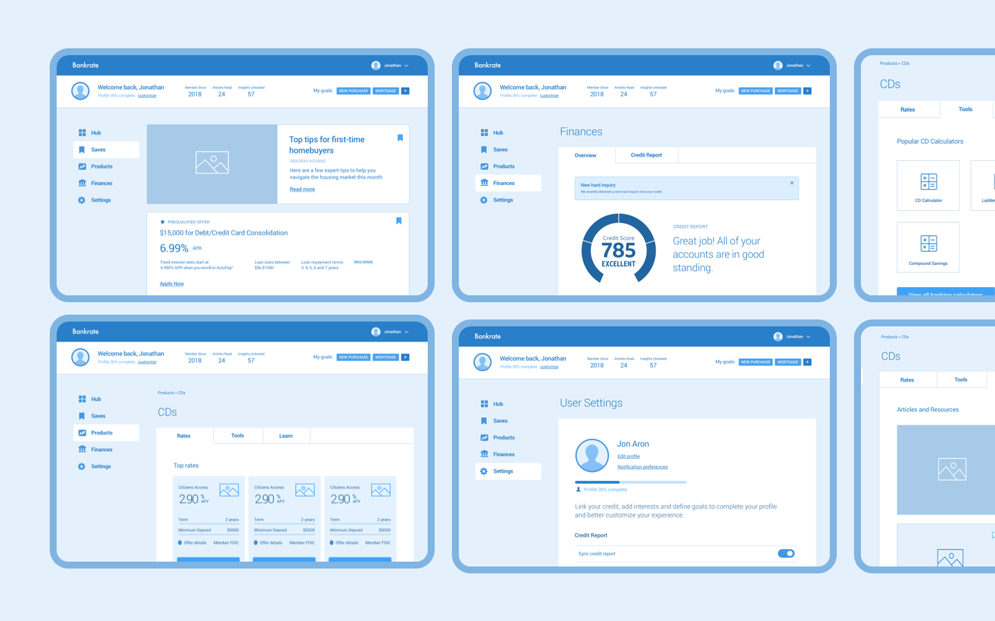
From here we began wireframing the core screens that we aligned on within our design sprint. In addition, we began wireframing the solution as it would appear on desktop to ensure our mobile-first approach would naturally scale up for desktop and tablet users. It was during this time that we also began to fully realize what would be in our MVP, pulling a few features for initial launch and adjusting wireframes as needed.
Design
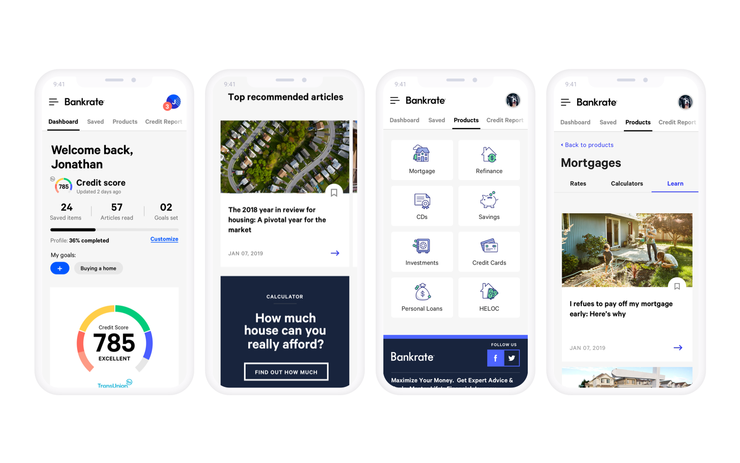
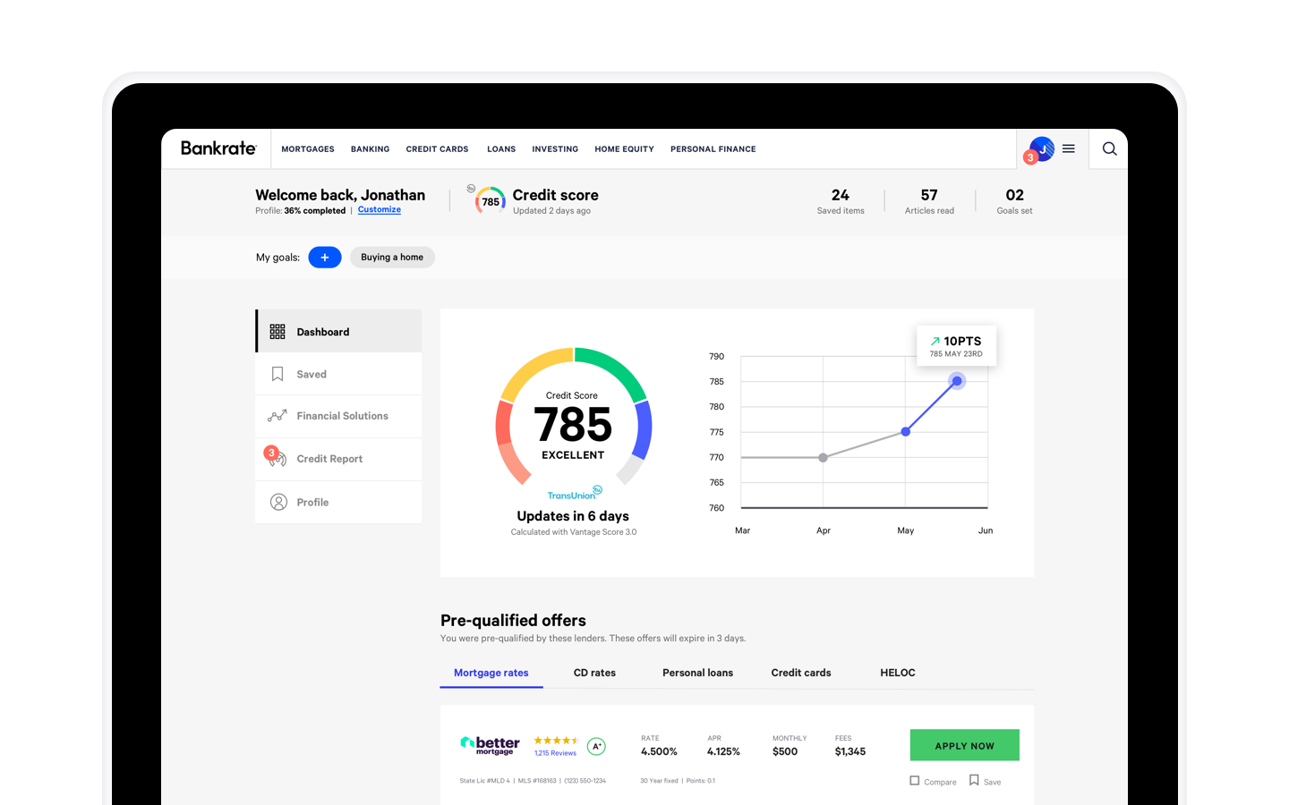
With the core experience wireframed, our visual designers began creating high-fidelity screens of the final solution. It was during this stage that we solved for edge cases and the various assets we’d need for multiple user scenarios. In addition, with the personalized nature of the app, we needed to create examples of dashboards for a number of different Bankrate users that would be at different stages along their financial journey. For instance, the experience of a first-time homebuyer would be very different than someone actively saving for retirement or investing. In addition, this is when the team began to explore entry points and onboarding.
Selected Works

BankrateUX, UI, Responsive, Web App

AllconnectBranding, Responsive Design, UX/UI

Heritage HarvestBranding

Expert FlyerBranding, UX, UI, Mobile App

HughesNetMobile Ecommerce, UX/UI

DIRECTVMobile Ecommerce, UX/UI

TraneUX/UI, Product Discovery, Dealer Location

Mattress FirmUX/UI, Product Discovery, Ecommerce

Medicare MarketplaceUX/UI, Co-creation