Allconnect
Re-establishing a brand as a trusted home services marketplace.
Overview
Allconnect is a company that allows customers to connect all their home services at once. Deep data integrations with the major home service brands allow customers to shop and compare plans for internet, TV, home phone, home security, electricity and more. Allconnect had been a business that was primarily focused on driving sales through partner phone channels. After it was acquired by Red Ventures in 2017, I was charged with helping to rethink its digital presence and future as a meaningful product.
Brand Sprint
Before diving into discovery activities, I kicked things off with a brand sprint to align senior stakeholders on how we collectively viewed Allconnect. This was largely based on Google Ventures 1-day brand sprint with the order and details slightly shifted to work better for us. Aligning on brand decisions at the outset helped us make smarter decisions later. After taking the team through these activities, we aligned on some core values, ausdiences and traits of the Allconnect brand. We were more mass appeal than niche. We were slightly more playful than serious, but heavily innovative. We landed firmly in modern vs. traditional in tone and slightly more friendly than authoritative. In looking towards the future roadmap, we aligned on a long-term vision of Allconnect playing the role of a home connection assistant, eventually available not only on the web but in native mobile apps and voice.
Co-creation: Discovery
Over 3 days of collaborative sessions, I aligned with key stakeholders on what the initial goals would be for our phase 1 relaunch. A team of design, UX, marketing, analysts and engineering came together during co-creation to outline the customer user flow. I facilitated these sessions as well as participated. Our first day was dedicated to learning as much as possible before moving into solutions. The Discovery session included goal setting, stakeholder interviews, sales agent interviews, competitive analysis, scenario mapping, how might we notes and journey mapping. For scenario mapping we used the existing site to understand how the 3 audiences we aligned on in the brand stage - movers, millenials, comparison shoppers - would feel navigating the current site. In addition to clear usability issues, a shared understanding that we could be doing a better job articulating Allconnect's role as a marketplace was formed as we went through these activities and uncovered pain points.
Co-creation: Ideation
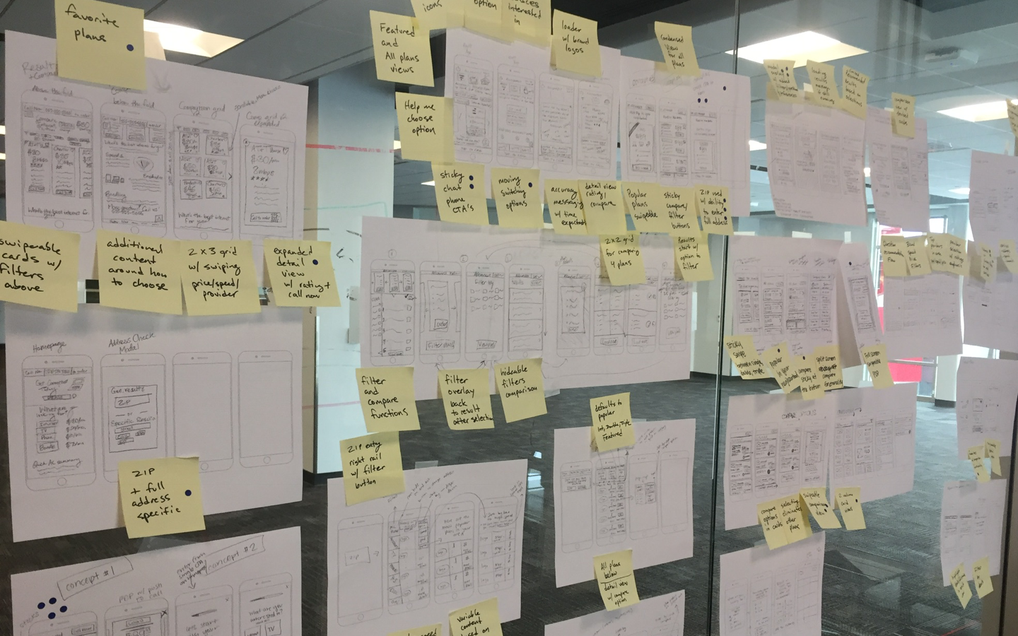
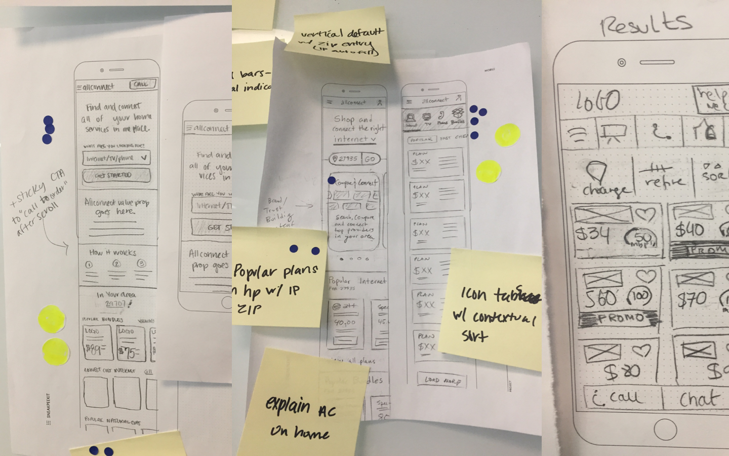
Over the next day and a half, the team sketched independently on the core shopping experience. This meant focusing on the landing page, search entry, search results, comparison, filtering and product details. We took a mobile-first approach knowing the final solution would need to be responsive. Each team member presented concepts and I annotated core themes as they presented. Next we silently voted on potential solutions and then discussed with the group at large. This process was repeated with the group incorporating ideas that had the most energy into their sketches during each round of sketching. The product owner and lead UX designer served as final decision makers and aligned on the direction for each of the focus areas.
Co-creation: Alignment
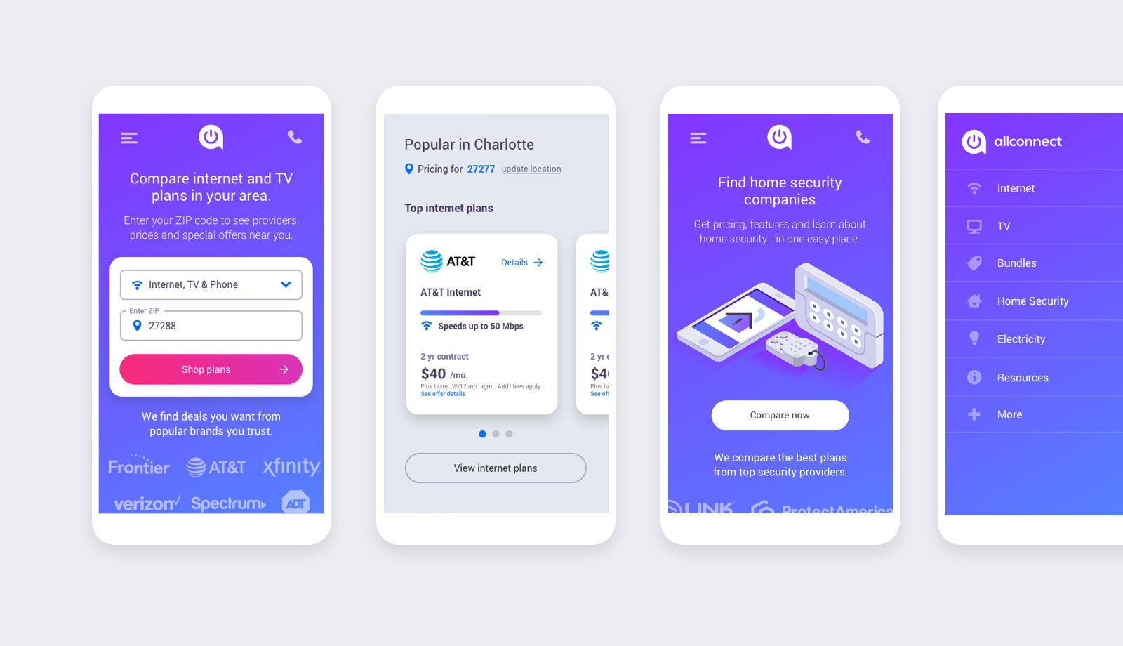
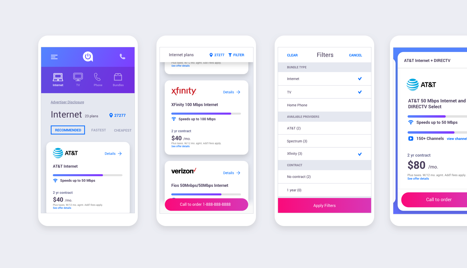
We aligned on a landing page that lead with a quick entry to search and then built value and trust around the Allconnect brand. Users had the option to select the type of services they wanted to search, enter in their address and get straight to results. Our results page had icons to allow users to quickly jump from one type of service to another. If a user that searched for Internet was curious about TV packages or bundles it was a tap away.
Wireframing
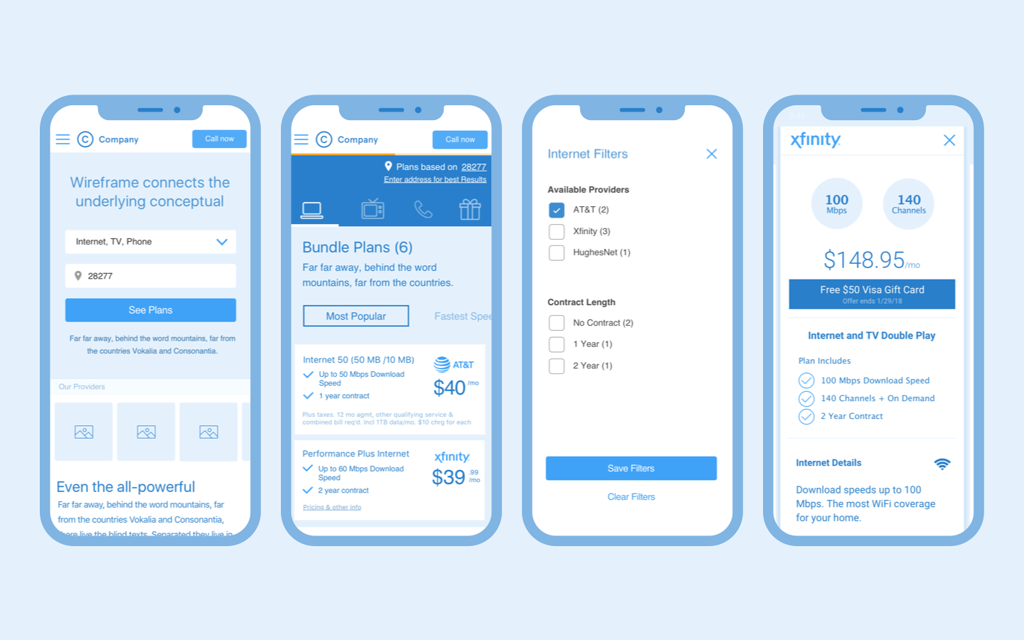
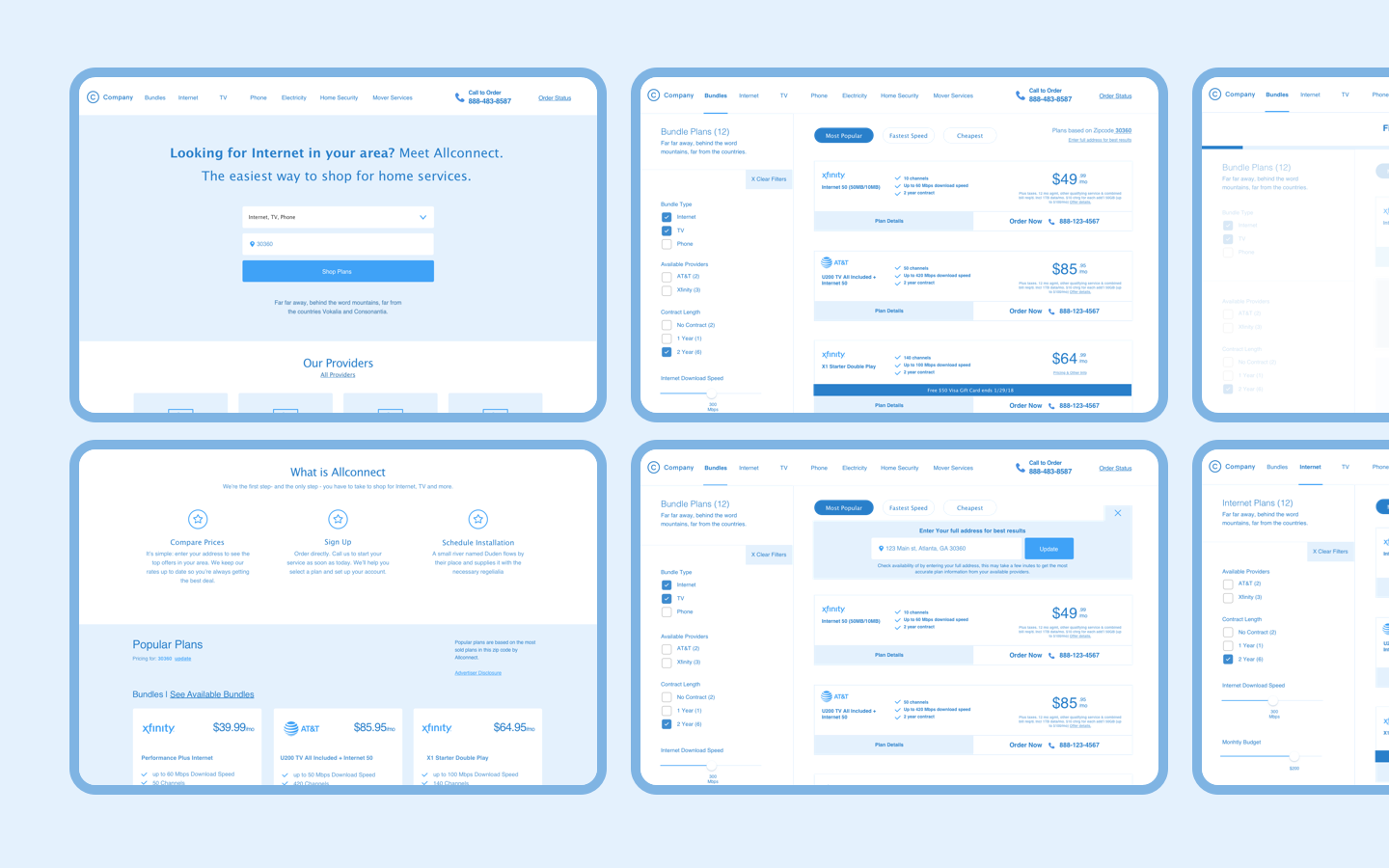
Next we moved past co-creation and into wireframing the core flow. Details on interactions like filtering and serviceability were added at this stage. We also began to scale up our mobile solution to desktop and making any necessary adjustments. One notable shift on desktop was treating the product details differently. While on mobile these appear as full screen takeover, the desktop solution relies on an accordion solution that expands the card without showing a modal. We worked closely with our development and engineering team to make sure these would be able to be produced efficiently.
Design
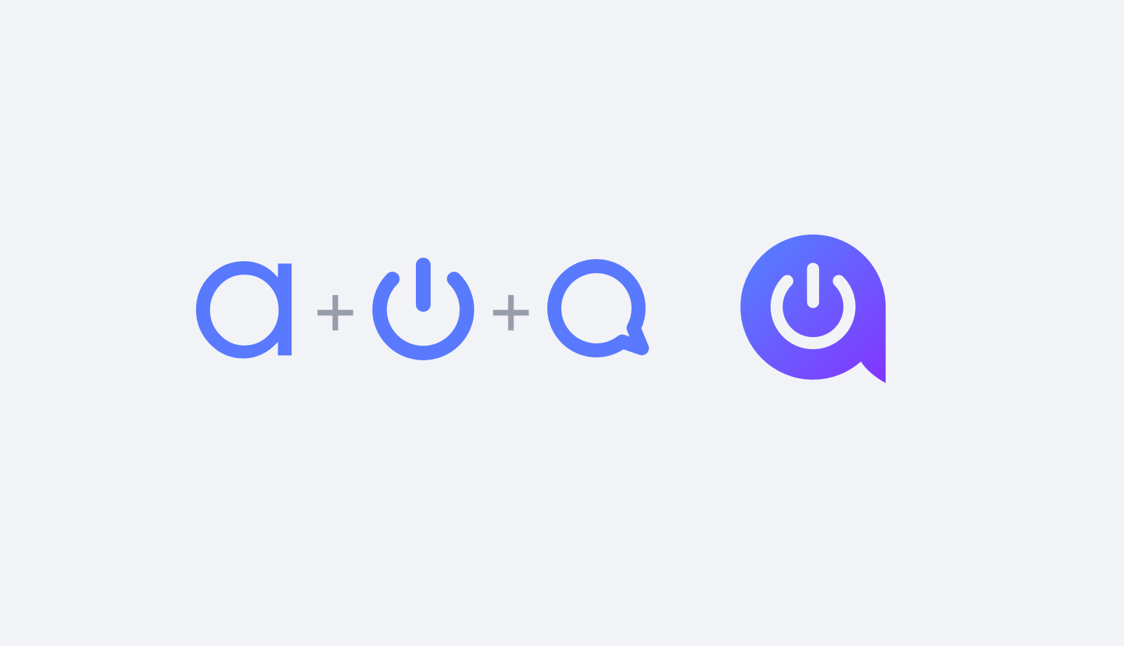
While initial wireframes were being created, I began driving our efforts on branding. Part of this was exploring how we might shift the logo. The new logo consists of an icon incorporating visual cues of a lowercase a, chat bubble and power symbol to create a unique mark. With the long term vision of Allconnect becoming more of a product than a website, I looked to trends within the application space to help drive our colors. I quickly knew I wanted something clean with vivid pops of color. I narrowed down to the chosen color scheme after exploration and debate. As wireframes were completed, I began to layer in branding and UI styles that I had been developing. In addition, I created a system of design patterns that could be used to keep the site consistent and speed production. This system was used to create core pages that fell outside the scope of our co-creation process. Allconnect has 150+ pages and a design system helped us scale easily.

Site Experience
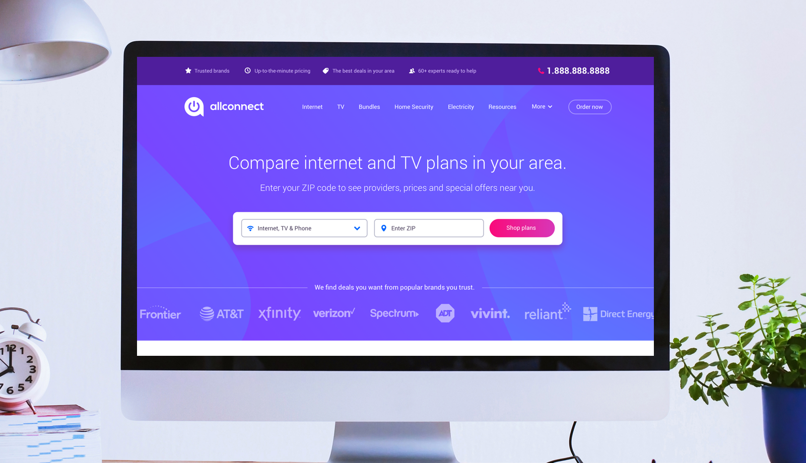
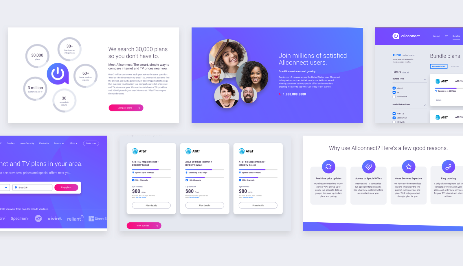
A clean and straightforward layout allowed customers to easily enter in their location and access available plans. Below the main call to action the focus was around building customer trust by highlighting the features that separate Allconnect from other comparison and marketplace sites. Local plans were also surfaced on the landing page based on the ZIP code of the customer IP address - this gave users immediate access to relevant results. Below plans the messaging focuses on the benefits of using Allconnect and its large base of satisfied customers.
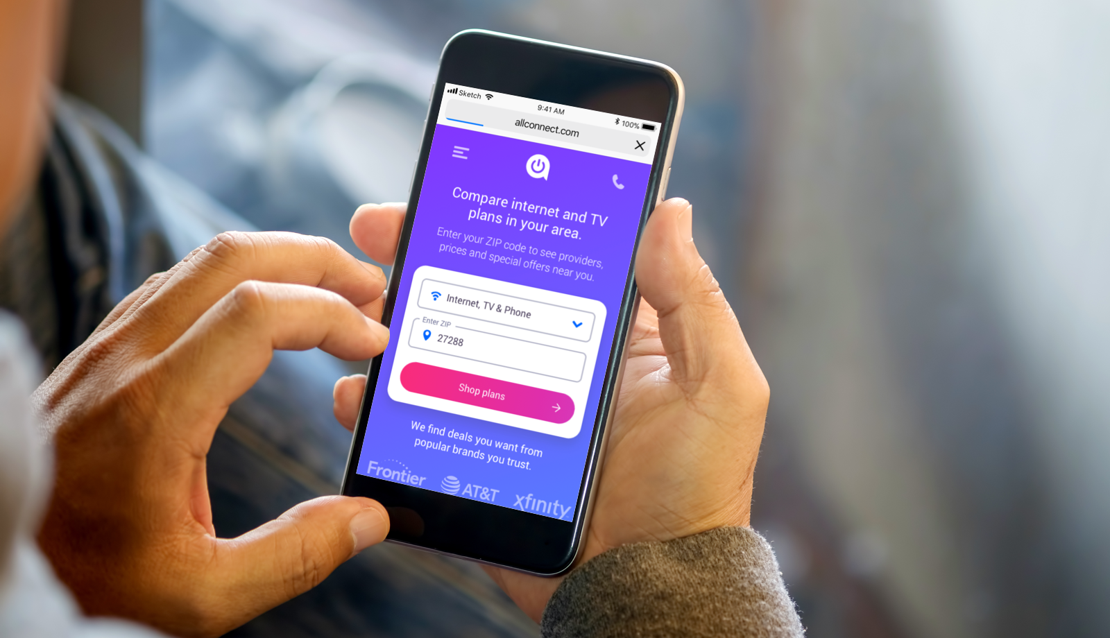
Plan result cards used colorful gauges to allow customers a quick visual reference to compare the core attributes of each plan. This became especially important when comparing plans that included multiple services like internet & TV. The mobile experince was shifted in some meaningful ways to make the act of shopping and comparing services on a smartphone as easy and intuitive as possible.
Results
The rebrand and site redesign were a definitive success. Site visit conversion is currently up 75% and mobile revenue per visit is up 230%. This is especially important considering mobile makes up 50% of traffic.
Selected Works

BankrateUX, UI, Responsive, Web App

Expert FlyerBranding, UX, UI, Mobile App

AllconnectBranding, Responsive Design, UX/UI

Heritage HarvestBranding

HughesNetMobile Ecommerce, UX/UI

DIRECTVMobile Ecommerce, UX/UI
TraneUX/UI, Product Discovery, Dealer Location

Mattress FirmUX/UI, Product Discovery, Ecommerce

Medicare MarketplaceUX/UI, Co-creation