Heritage Harvest
Defining the new venture for a family farm established in 1865
Inital approaches
Traditional Farmhouse
This direction emphasizes the heritage aspect of the farm, with traditional farmhouse imagery and crests. The focus was on the land and the act of farming. This exploration was done with the notion of potentially including any landmarks with significance on the properties.
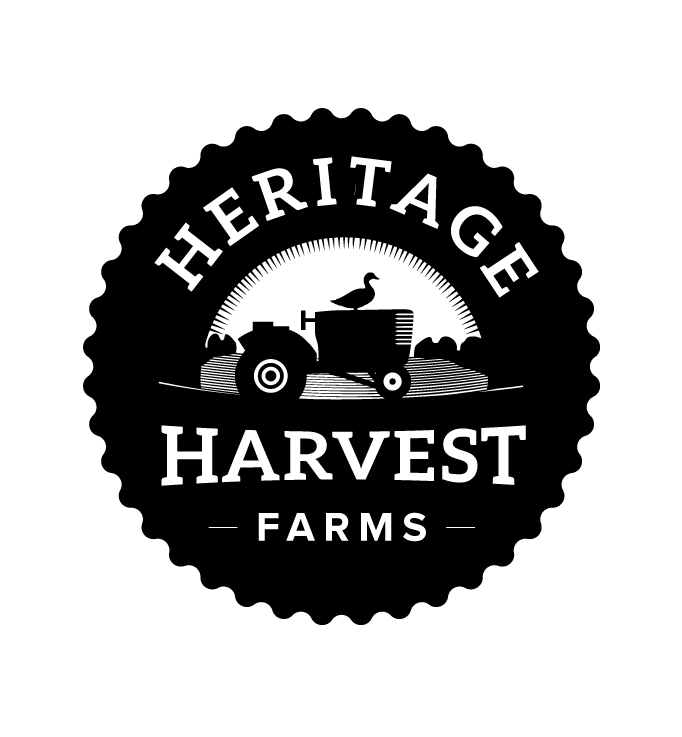
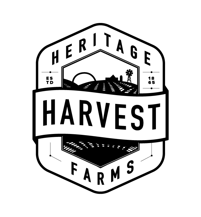
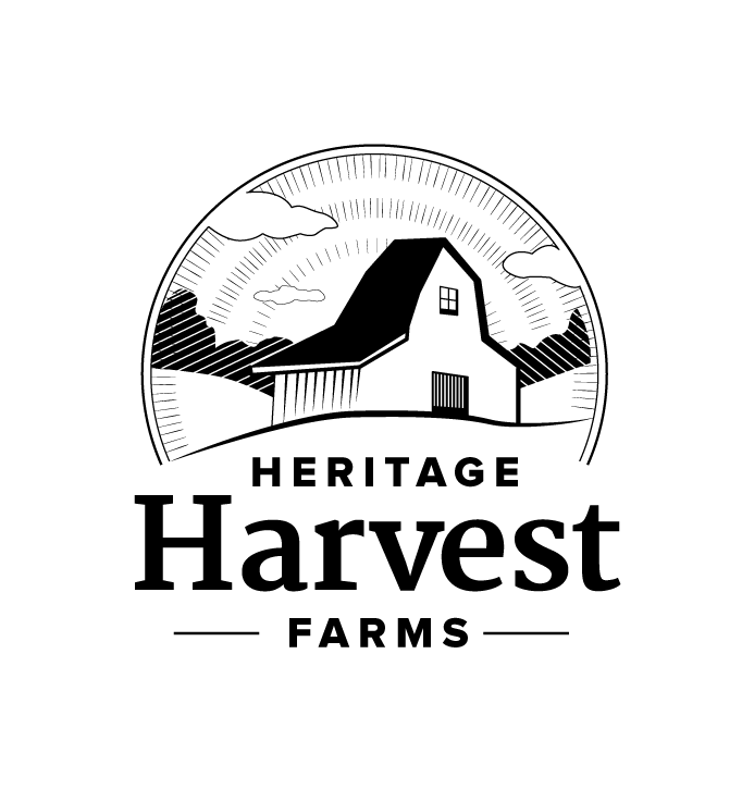
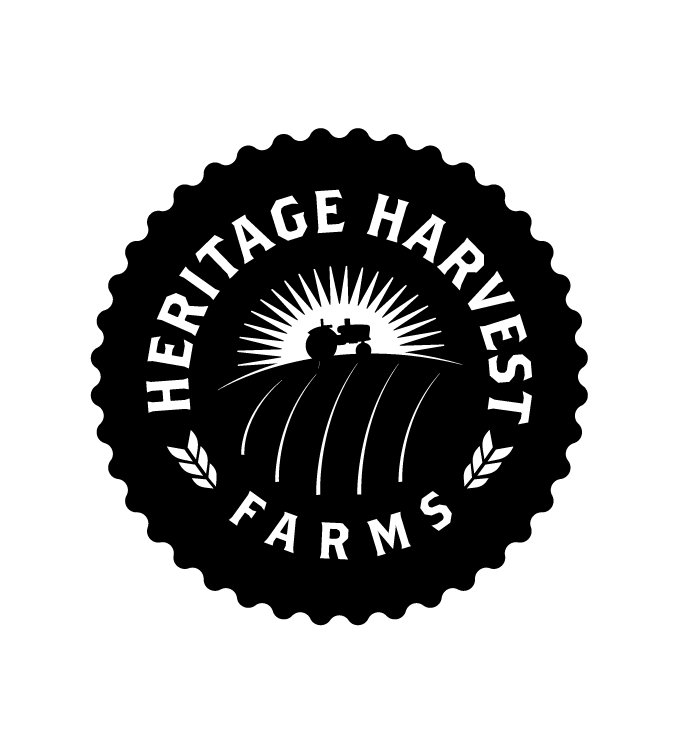

Typographic
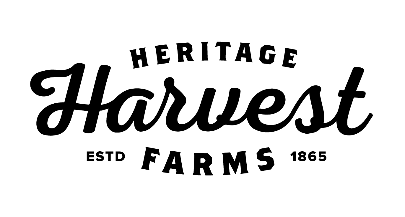
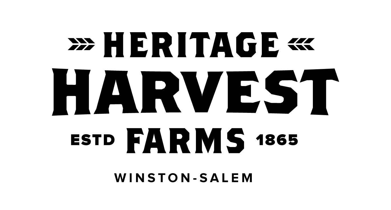
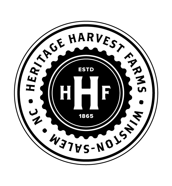
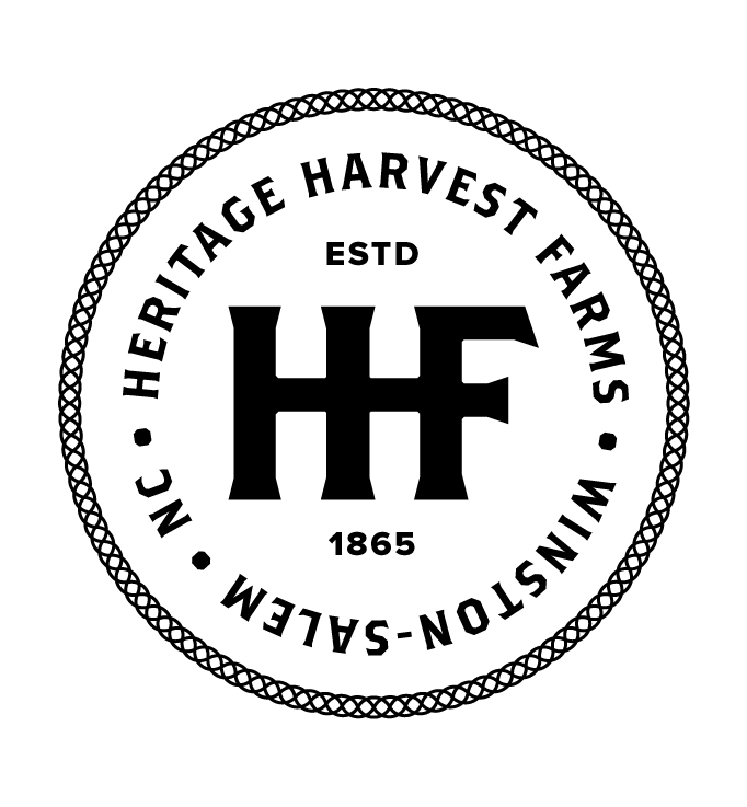
Harkening back to an era of hand-painted signs and business marks, this solution used a limited set of typographic fonts to build a branding system. With a main logo, multiple badges and various sayings, this direction would create a unique, but unified voice for the farm.
Contemporary Line Art
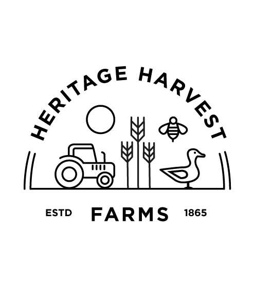
A more modern approach, emphasizing how Heritage Harvest was a different, fresh take on farming. Closer in aesthetic to the farm to table restaurants the products could end up serving.
Final Solution
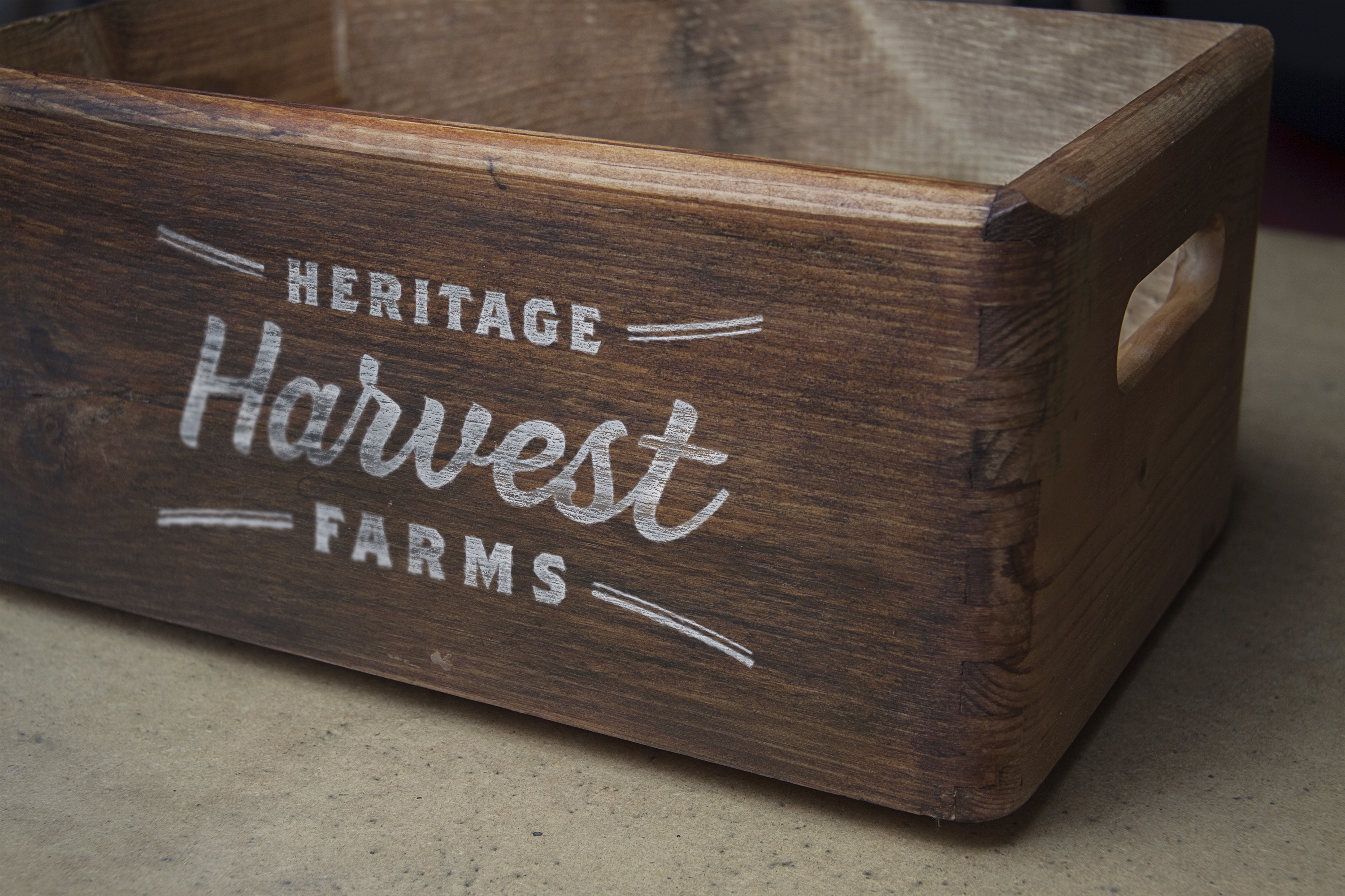
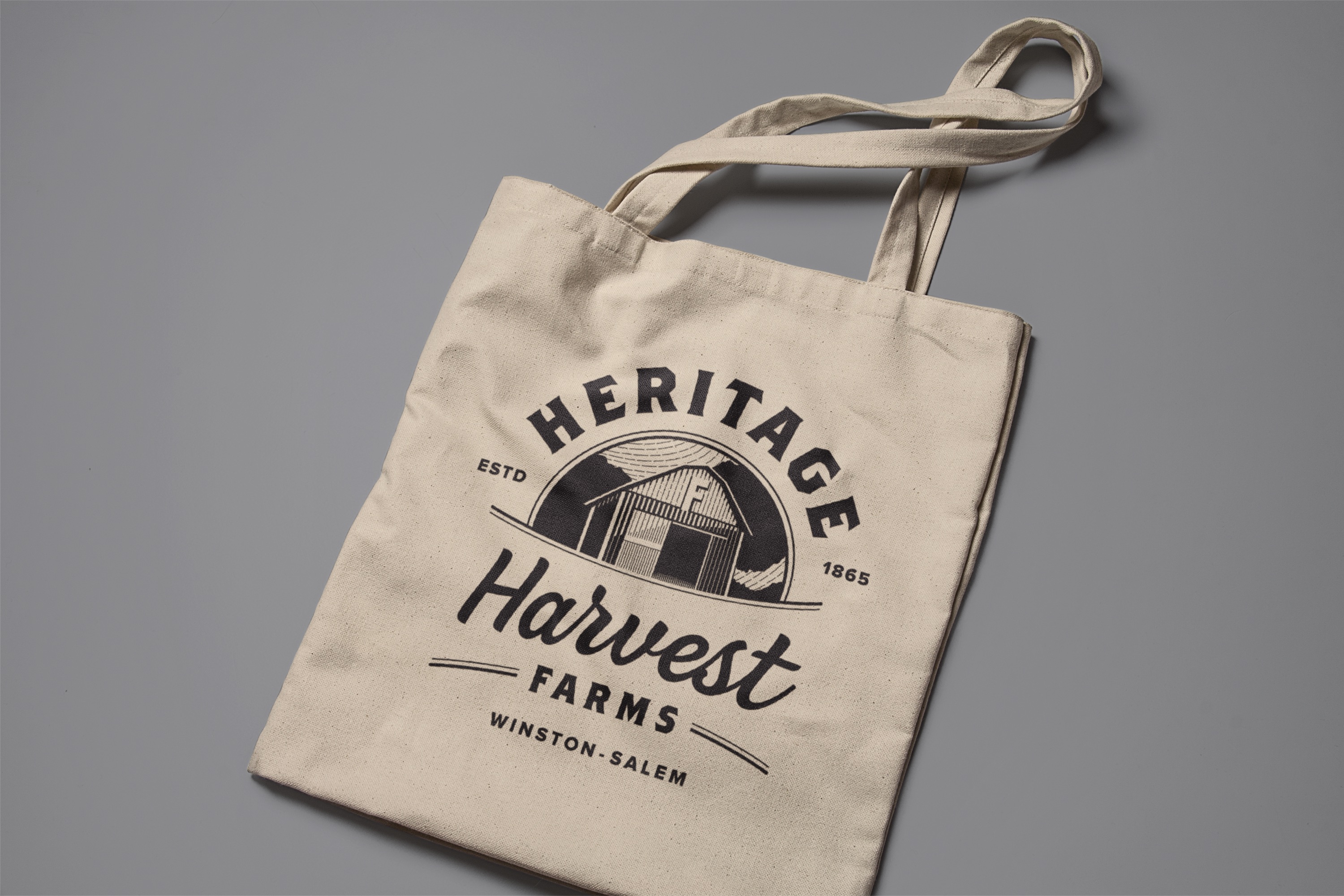
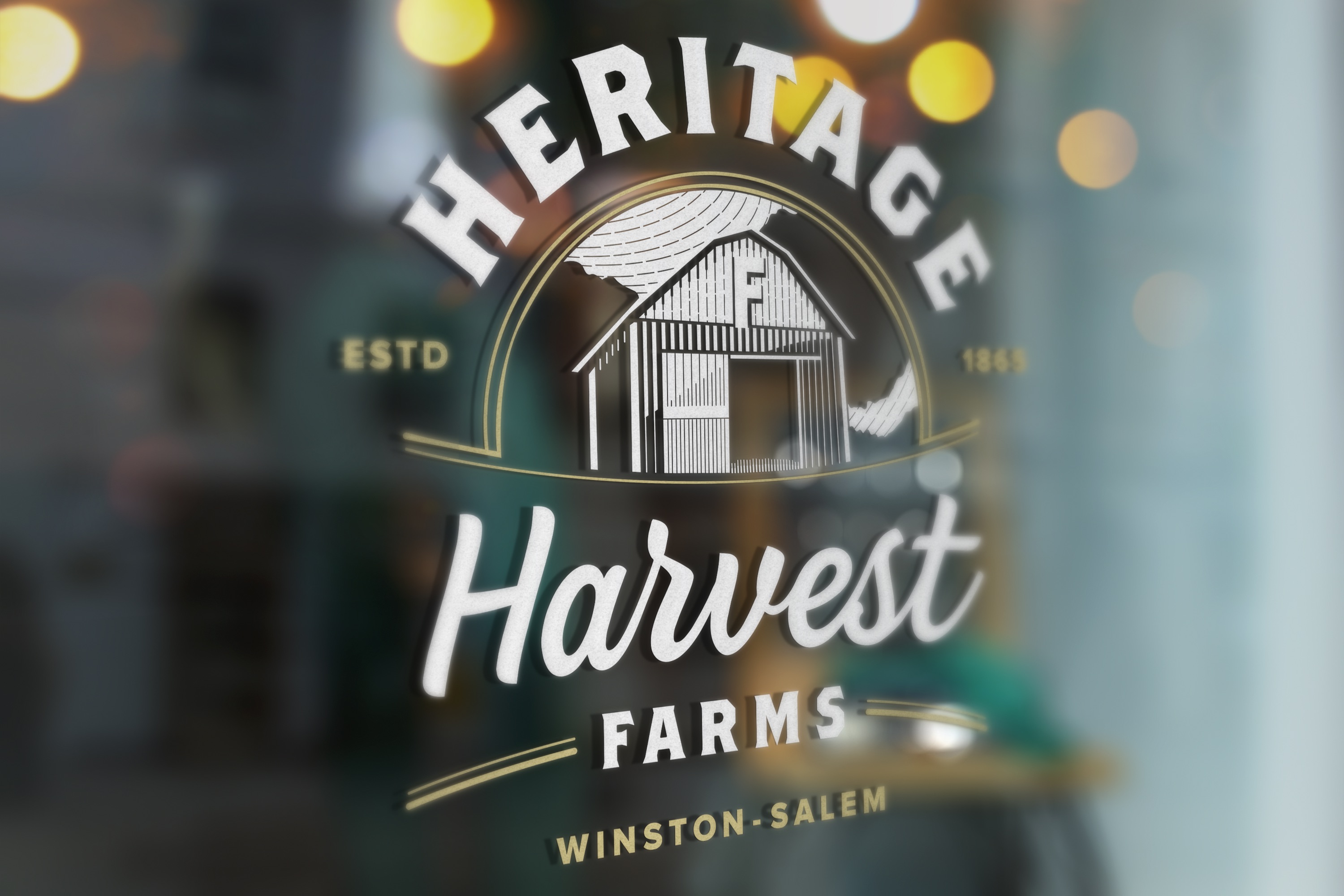
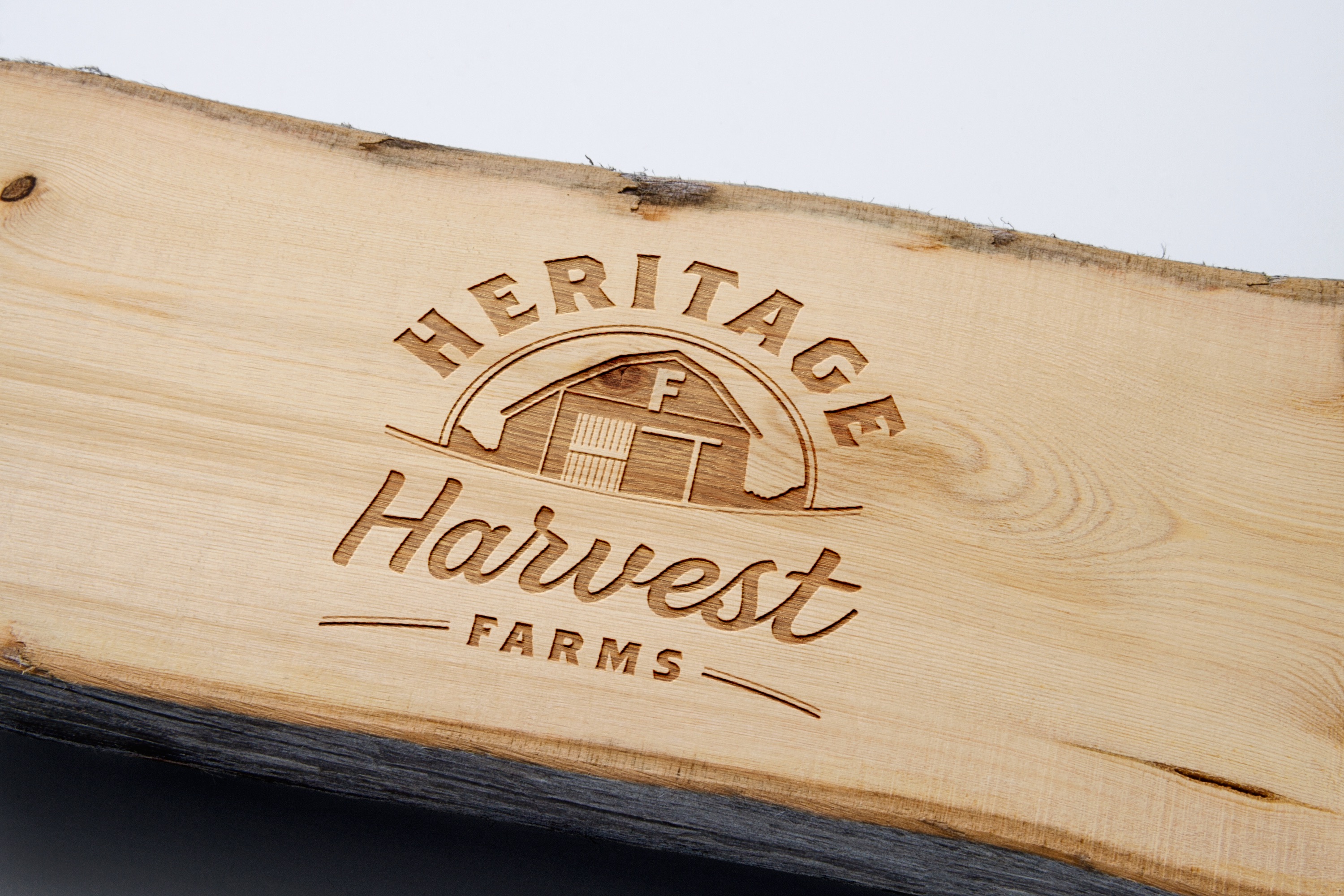
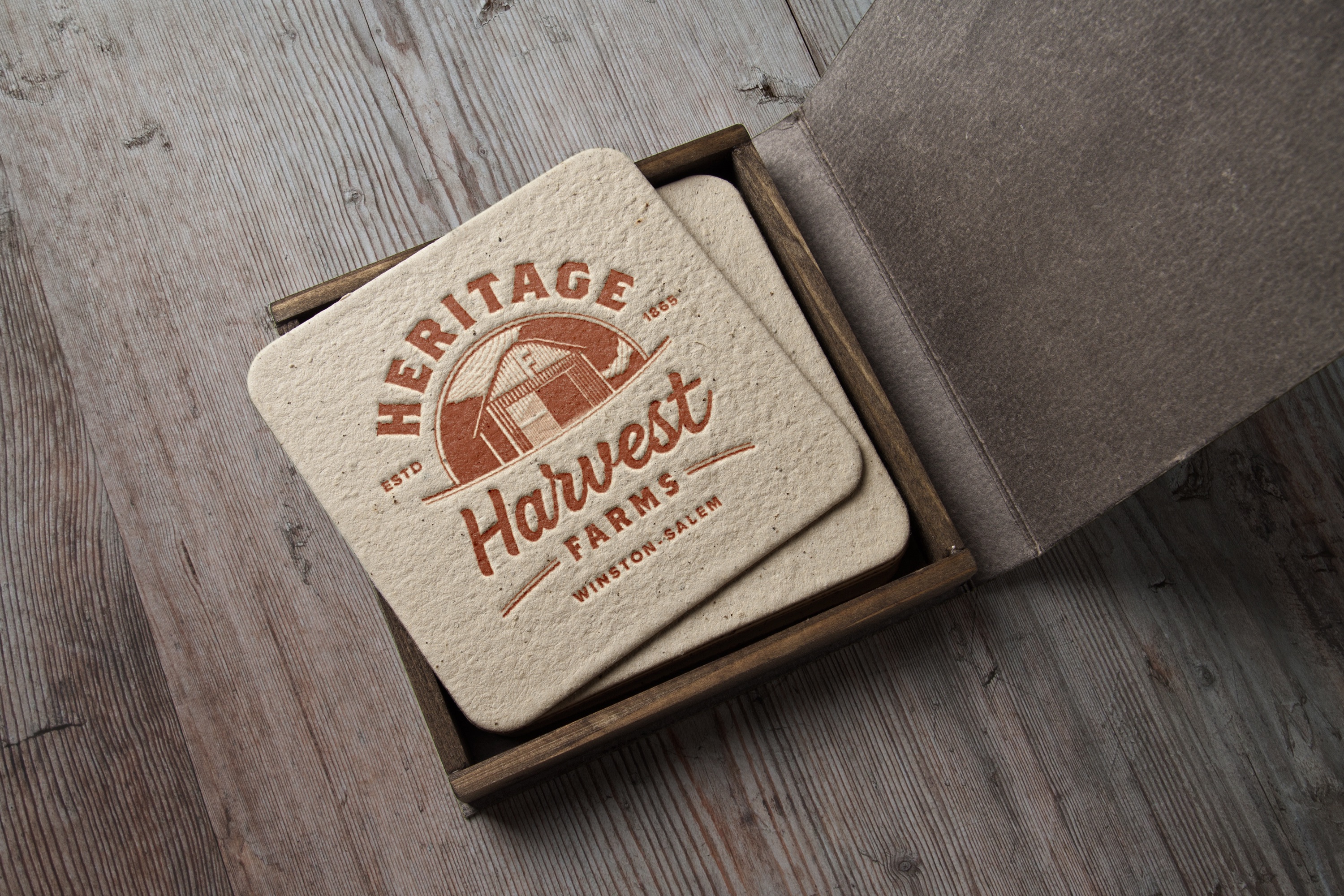
A narrowing of the approach using elements of both the typographic solution and farmhouse imagery. The mark focused on a landmark called the "F barn" that had a rich history - serving as the hero version of the logo. A series of marks were created to keep the brand flexible and allow room for multiple applications.

Selected Works

BankrateUX, UI, Responsive, Web App

Expert FlyerBranding, UX, UI, Mobile App

AllconnectBranding, Responsive Design, UX/UI
Heritage HarvestBranding

HughesNetMobile Ecommerce, UX/UI

DIRECTVMobile Ecommerce, UX/UI

TraneUX/UI, Product Discovery, Dealer Location

Mattress FirmUX/UI, Product Discovery, Ecommerce

Medicare MarketplaceUX/UI, Co-creation