HughesNet
Creating a mobile first shopping experience for satelite internet
Overview
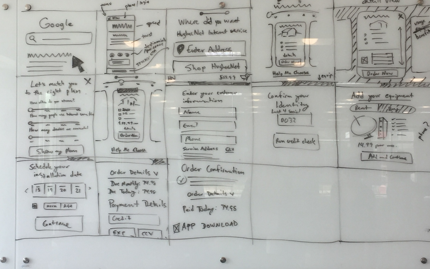
HughesNet is a satellite internet provider that helps users access fast internet speeds, often in areas where broadband is unavailable. The challenge was to create a mobile shopping experience that helped educate potential customers on HughesNet's data usage modal and enabled them to select a plan that was right for them. The project started with a 3 day co-creation session where analysts, marketing directors, visual designers, content-strategists and UX designers worked together collaboratively to create a solution. At the end of the session we had aligned on the entire user journey.
Challenge
HughesNet is a satellite internet provider that helps users access fast internet speeds, often in areas where broadband is unavailable. Our challenge was to create a mobile shopping experience that helped educate potential customers on HughesNet's data usage modal and enabled them to select a plan that was right for them. In addition, we created a complete mobile-first cart experience that allowed users to easily checkout onlne.
Process
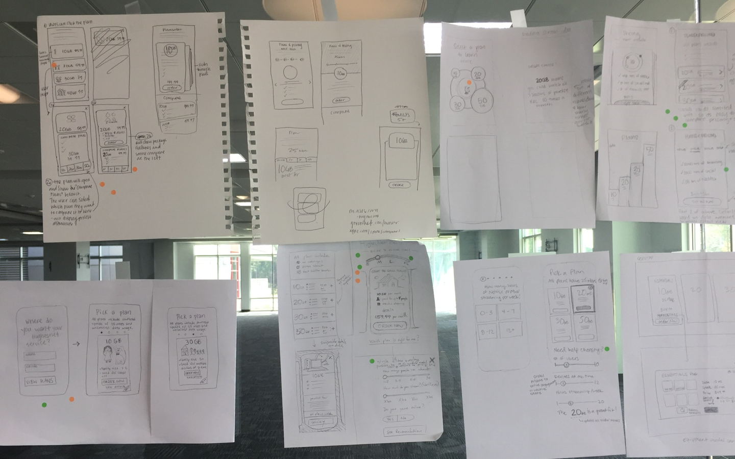
We held a 3 day co-creation session, where analysts, marketing directors, visual designers, content-strategists and UX designers worked together collaboratively to create a solution. The activities included a day of discovery and goal setting before moving into multiple rounds of sketching and voting. At the end of the session we had a storyboard of the entire user journey that I used to create a high-fidelity prototype. User testing helped us shift a few of our design decisions to address some minor pain points. I then finalized the design and readied it for production.
Co-Creation: Discovery
In our first session, we focused on creating a shared understanding of our goal and product. We interviewed a sales team from our call center to understand the questions customers had when calling in and hurdles the agents faced when selling plans. We had our data analysts give us a breakdown of keyword sources, device mix and product mix. I also lead an empathy mapping exercise focused on the existing experience that used personas the UX research team had created in advance. Last we used How Might We Notes to uncover areas of opportunity.
Co-Creation: Ideation
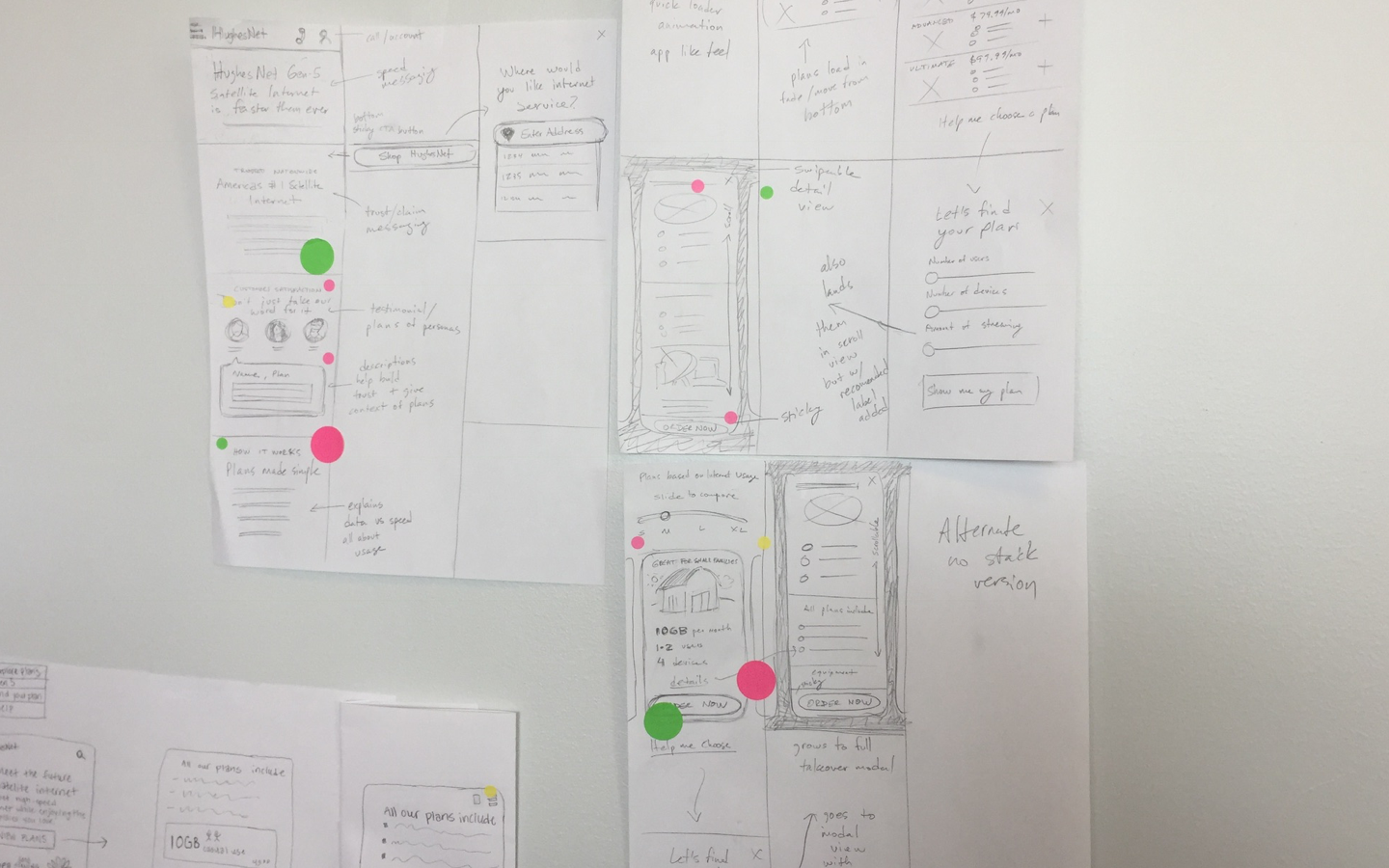
A few key takeaways had emerged from our day focused on discovery. Hughesnet plans are based on data usage and not speed, so we knew education would be important. In addition, the equipment selection process within the cart flow had multiple payment options and would need to be thoughtfully handled. We sketched mobile solutions that focused on product discovery as well as checkout. A few ideas emerged that the group began to align on. One was the idea of adding familiar size labels (S, M, L, XL) to internet plans to reinforce the concept of pricing based on data usage. Another was using imagery to reinforce the plan size. We experimented with the idea of gauges, barns, rockets, and more that would scale up in size with each larger plan. Tappable inputs within the cart flow also became something the team aligned around.
Co-Creation: Alignment
Our lead designer and product owner acted as deciders, voting for the final direction for the different parts of our solution. I whiteboarded the overall storyboard of where we landed, driving discussion and decisions for any areas where we had gaps. Our final experience integrated a number intersting ideas into a single solution.
Design
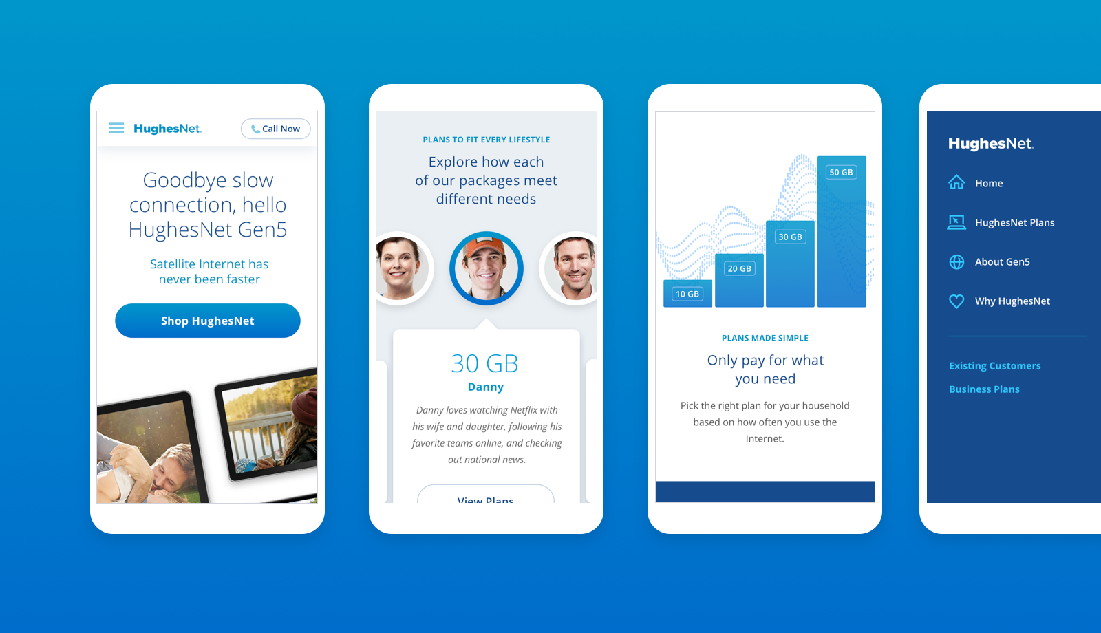
With the scope of the project relatively narrow and limited to only mobile, I decided to use our story board and sketches to move into high-fidelity design. The final landing page included messaging around HughesNet's latest product, Gen5, and a call to action for customers ready to shop. In addition, messaging reinforcing the data usage model that HughesNet plans are based on was included. Packages were tied to different users to help potential customers understand how the amount of data might translate to customer needs. A graph that spelled out the pay for usage model in simple terms reinforced this message.
Experience
Direct messaging for HughesNet's latest product, Gen5, and a simple call to action allowed immediate access to shopping. Additional messaging reinforced the data usage model that are the basis of HughesNet plans. Tying packages to different customers helped users understand how GB of data translated to needs. A GB graph spelled out the pay for usage model in simple terms.
Product Selection
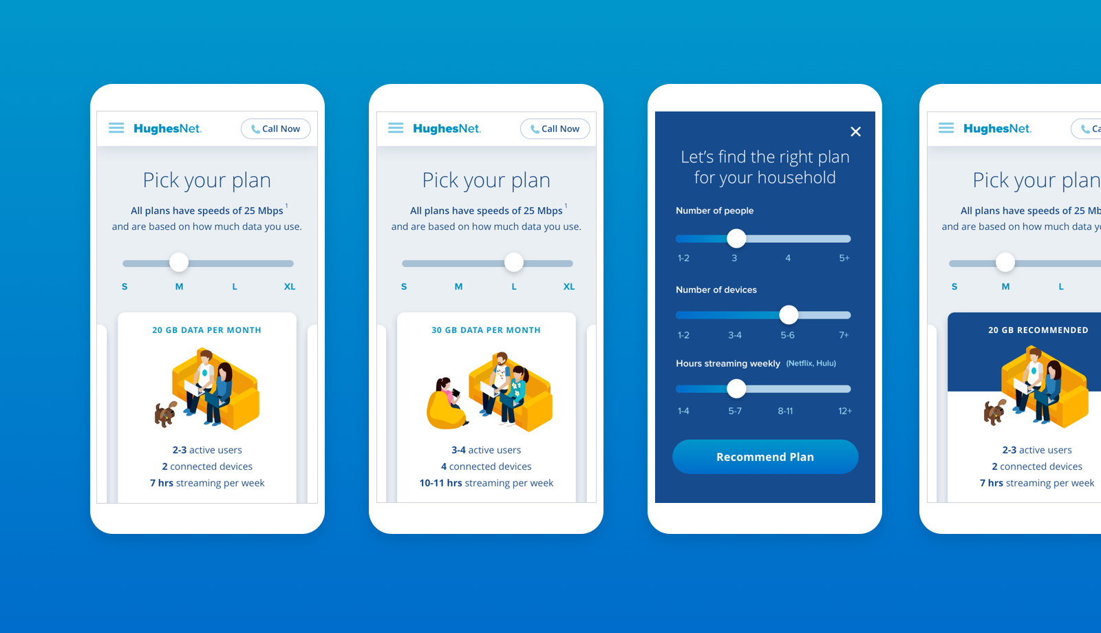
A slider with size labels helped reinforce the idrea of plans being based on GB allowance vs speeds. Users could either swipe between cards or use a slider to swap out plans. We tested different imagery within our plans cards and found that users had an easier time relating to a family using devices that grew as plans increased in size. In user testing, plan selection took much less time and the users felt more confident when this imagery was used. We also rolled out a "help me choose" feature for customers who still felt uncertain. By easily setting a few values they could get a package recommendation.
Comparison
A slider with size labels reinforced plans being based on GB allowance. Users could either swipe between cards or use the slider to swap out plans. We tested image options and found that users had the easiest time relating to imagery of a family that grew as plans increased in size. Plan selection took less time and the users felt more confident in decisions. We created a "help me choose" feature for customers who still felt uncertain. Adjusting family size and streaming habits allowed users to get a recommended plan.
Checkout
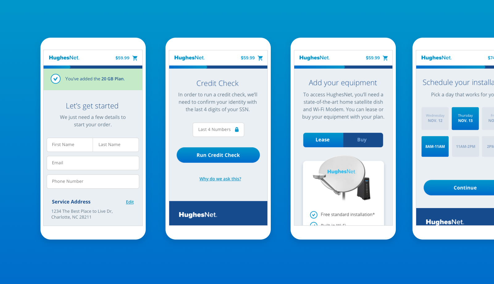
The mobile cart flow was created to be as simple as possible for users. Users immediately received a notification to reinforce package selection when entering the cart. The site navigation no longer appeared - focusing the user on the task at hand. Clicking the shopping icon would give the user an itemized breakdown of their order. A progress indicator along the top helped reinforce where they were within the cart flow and that they were making steps towards order completion. Trust indicators like security icons and tooltips explaining the need for sensitive information helped keep users within the flow. Touch friendly tabs and buttons helped the cart process feel good on a mobile device.
Checkout
Users immediately received a notification to reinforce package selection when entering the cart. The site navigation no longer appeared - focusing the user on the task at hand. A progress indicator along the top reinforced how far along they were within the cart flow. Trust indicators were used to reinforce security and tolltips explained the need for any sensitive information. Touch friendly tabs and buttons helped the cart process feel good on a mobile device.
Selected Works

BankrateUX, UI, Responsive, Web App

Expert FlyerBranding, UX, UI, Mobile App

AllconnectBranding, Responsive Design, UX/UI
Heritage HarvestBranding

HughesNetMobile Ecommerce, UX/UI

DIRECTVMobile Ecommerce, UX/UI
TraneUX/UI, Product Discovery, Dealer Location

Mattress FirmUX/UI, Product Discovery, Ecommerce

Medicare MarketplaceUX/UI, Co-creation